Difference between revisions of "Noorderboulevard"
| Line 3: | Line 3: | ||
De Noorderboulevard: A visual research into a culturally diverse street. | De Noorderboulevard: A visual research into a culturally diverse street. | ||
| − | As a graphic design student I spend a lot of time thinking about the significance of my professional course. What is graphic design today, | + | As a graphic design student I spend a lot of time thinking about the significance of my professional course. What is graphic design today, what is it all about? Within the professional course, I noticed a tendency towards designing according to a specific aesthetic that highly values the details of the design, even more than its practicality. Furthermore, the concept is presented as a crucial aspect of design within the field. But what about the social value of graphic design? |
When looking at a typical urban shopping street, often located in middle to lower income areas, one will find lots of shops representing a whole other side of graphic design. Often the graphic design we find in these streets are labelled by professional graphic designers as ‘ugly’and ‘unprofessional’. However, I wonder if it is correct to label these designs as ‘bad’ graphic design. | When looking at a typical urban shopping street, often located in middle to lower income areas, one will find lots of shops representing a whole other side of graphic design. Often the graphic design we find in these streets are labelled by professional graphic designers as ‘ugly’and ‘unprofessional’. However, I wonder if it is correct to label these designs as ‘bad’ graphic design. | ||
Revision as of 13:32, 7 June 2016
Author: Isabel Valstar
De Noorderboulevard: A visual research into a culturally diverse street.
As a graphic design student I spend a lot of time thinking about the significance of my professional course. What is graphic design today, what is it all about? Within the professional course, I noticed a tendency towards designing according to a specific aesthetic that highly values the details of the design, even more than its practicality. Furthermore, the concept is presented as a crucial aspect of design within the field. But what about the social value of graphic design?
When looking at a typical urban shopping street, often located in middle to lower income areas, one will find lots of shops representing a whole other side of graphic design. Often the graphic design we find in these streets are labelled by professional graphic designers as ‘ugly’and ‘unprofessional’. However, I wonder if it is correct to label these designs as ‘bad’ graphic design.
I myself do believe that graphic design provides a physical shape where needed. This could be anything, for instance; a cover of a book, a story or maybe the visual language of a specific (sub)culture. This is what, in my opinion, makes graphic design a visual representation of any identity presented to the public.
With my research project I intended to find a deeper and social meaning within graphic design. I set up a visual research into the culturally diverse street 'Noorderboulevard' (located in Rotterdam North). During this research I specifically focussed on the social and cultural aspects of this location and how these are visually represented (e.g. shop windows, displays etc). By looking at the graphic design of the shops I tried to determine cultural and- or ethnical heritage of the shop owners in question.
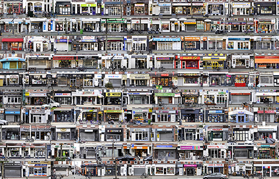
After doing some contextual and historical research on the street, I elaborated a more experimental research where I looked into the visual aspects of the shop windows, for instance at the use of colours. I documented the shop windows of the street using photography. (see image 1)
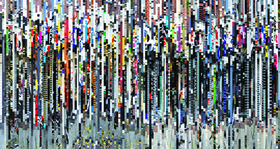
A condensed image of the street The ‘Noorderboulevard’ shows us a bright projection of a cluttered street using bright colours. (see image 2) Shop owners working in the street had positioned themselves in a so called ‘low priced’ segment of retail, focusing on a group of people from a somewhat lower economical class. This is reflected in the colour experiments, where we see either a lot of grey tones or rather the opposite; bright and catchy colours. These are often used by low budget shops (e.g. Kruidvat) where it is all about communicating low prices. (see image 3 and 4)
This is however a bit contradictory to some of the gentrification developments within the area. Take for example the street just around the corner: ‘Zwaanshals’, a street that consists of renovated properties, trendy design shops and a contemporary coffee bar. The graphic design also looks different from that of the Noorderboulevard (which looks homogeneous), it is clean in design and uses coherent colours. One could say the graphic design here looks more professional and indeed I, as a professional graphic designer, can relate much better to this kind of graphic design than the Noorderboulevard's.
After doing various visual experiments I came to a decision. It was time for me to zoom in and take a look under the surface in order to find out more about the social groups that lived in the street. Since the visual research revealed the large amount of Turkish and Moroccan shops, I decided to focus on that social segment.
I did this by portraying one particular shop named Dubai. This is a shop that sells mainly Moroccan products in order to provide the Moroccan people in The Netherlands with a piece of their identity. For this research interviewed the owner and photographed the shop inside out (see image 5, 6 and 7).
This research told me a lot about the meaning of graphic design as well as about the social groups the street. Looking back at the project I can see that when it comes to graphic design, it goes so much further than the shop windows. It is the décor around and the interior that completes the image of the shop. To the owners, graphic design seemed of very little importance. In fact, the lack of ‘professional’ design contributes to their image of being a low budget shop. This made me realize that graphic design can be overrated by professionals, and furthermore, as a professional graphic designer I am very likely to be working for clients coming from a higher economical class
I discovered that form sometimes exceeds function, a fact that maybe contradicts design's contemporary basics. I really hope (and wonder) that I will be able to provide designs for people on all social and economical levels, instead of unwittingly designing according to conventional design aesthetics.
NOTE VAN IRIS: er is nog een video die ze engels gaan ondertitelen en uploaden. Plaatsen bij intro over cultural diversity door Jan van Heemst

