Difference between revisions of "Humanae"
(Created page with "Humanae is “work in progress” project by Brazilian photographer angelica dass. The project Intends to make an inventory of the spectrum of different human skin color. Ther...") |
Rümeysa Önal (talk | contribs) |
||
| (3 intermediate revisions by 2 users not shown) | |||
| Line 1: | Line 1: | ||
| − | Humanae is “work in progress” project by Brazilian photographer | + | Humanae is “work in progress” project by Brazilian photographer Angelica Dass. The project intends to make an inventory of the spectrum of different human skin color. There is no previous selection of participants or classifications based on race, gender, nationality etc. The participants are volunteers who find out about the project and want to participate. The collection is an ever-growing mosaic, it is an open project with no end date. |
| − | Angelica | + | [[File:Angelica-dass-humanae 02.jpg|thumb| Portrait of Angelica Dass the Designer behind Humanae, first photograph of the series.]] |
| − | Dass uses the different colors of skin to celebrate the wide spectrum of color, and dilute the notion of superiority of a particular skin color. Using Pantone as a reference | + | Angelica belongs to a multiracial family, so growing up she was very aware of how others view her, especially because of the color of her skin. This led her to realize how the complexity of skin color is often forgotten by use of labels. This project is her pursuit of representing the true colors of our skin, rather than the untrue white, black, yellow, red or brown, which often try to contain us in boxes; Her aim is to catalog every conceivable skin color on this Earth. |
| + | Dass uses the different colors of skin to celebrate the wide spectrum of color, and dilute the notion of superiority of a particular skin color. Using Pantone as a reference and placing all the pieces on a horizontal line, she breaks the ideas of the preeminence of some races over the other. The process followed to select the background for each photograph is also very methodical, the background for each portrait is the Pantone color tone identical to a sample of 11X11 pixels taken from the face of the photographed. The alphanumeric codes of Pantone allow the images to be reproduced accurately between various types of media. | ||
| − | In my opinion, the idea of Pantone colors itself has premises of equality, as all colors have equal importance on the Pantone Scale. This creates a safe space for the project and enables one to see the beauty of all skin colors regardless of race and other social conditions. The absence of accessories in the photographs is another way of implying equality; by withholding any information about the subject apart from what is visible in the frame the photographer is inhibiting the viewer from making any judgments about the people photographed, thus project is challenging our ideas of color, nationality, races and other social boundaries. | + | [[File:1a48cb3c57788a3b42e0a160a554afe8ae87ab71 2880x1620.jpg|thumb|Selection of portraits from Humanae.]] |
| − | I feel this project is a great way of conveying ideas of equality, it empowers the people who are photographed as much as the people who are viewing it. It can be reproduced on various mediums accurately, and moreover, it is a great conversation starter when it comes to the topic of race and color. | + | |
| − | + | In my opinion, the idea of Pantone colors itself has premises of equality, as all colors have equal importance on the Pantone Scale. This creates a safe space for the project and enables one to see the beauty of all skin colors regardless of race and other social conditions. The absence of accessories in the photographs is another way of implying equality; by withholding any information about the subject apart from what is visible in the frame the photographer is inhibiting the viewer from making any judgments about the people photographed, thus project is challenging our ideas of color, nationality, races and other social boundaries. I feel this project is a great way of conveying ideas of equality, it empowers the people who are photographed as much as the people who are viewing it. It can be reproduced on various mediums accurately, and moreover, it is a great conversation starter when it comes to the topic of race and color. | |
| − | + | ||
| − | Even though the project has been very successful, one issue that I think could be addressed better is that of communication. The project seems to be very famous and known amongst | + | It has now become a collection that is being used as a tool by various professionals like teachers, scientist and researchers in the fields of education, human ethnicity, pathophysiology, face recognition, Alzheimer's etc.; this is the aspect of this project that interests me the most. Humanae being used by such variety of professionals is a great example of how an arts and design social project can be applied in other fields. |
| − | Another aspect of this project that I personally would like to change is the fact that is relying on a scale i.e. Pantone, which is not very universally understood. Not everybody | + | |
| − | I think as a project Humanae is very strong and has a lot of potential to make people think about their perception of skin color and ethnicity. Though it has its weak points, | + | Humanae seems to fall more in the domain of an artistic and participatory project. it is artistic because it is highly driven by the ideas of the designer and makes use of a strong narrative which is her personal view, but at the same time it is participatory as it empowers the participants in many ways, it is trying to break the stigma related to skin color by inclusion. Humanae addresses an issue which is very prevalent in the world right now and is against the ideas and preconceived notions of our society today. It thus also to some level qualify as a contextual and transformative piece of work; by using shared authorship and promoting local proposals that operate globally, it is creating awareness without political ideology. |
| + | |||
| + | [[File:Humanae-exhibit.jpg|thumb|Humanae in Exhibition]] | ||
| + | |||
| + | Even though the project has been very successful, one issue that I think could be addressed better is that of communication. The project seems to be very famous and known amongst the people that are aware of developments in the design world, but the issues and stigma related to skin color also exist in people that have more or less no access to this project. In many countries, the racial divide amongst people due is very ingrained in the local culture, it is very hard to change the ideas of people with such strong beliefs using such a passive stance about a sensitive issue. Maybe in this regard, I see an opportunity to educate and spread the word better. This is possible through a more immersive platform than just the internet, to make the project more inclusive. | ||
| + | |||
| + | Another aspect of this project that I personally would like to change is the fact that is relying on a scale i.e. Pantone, which is not very universally understood. Not everybody is aware of what Pantone stands for. I agree that the use of Pantone colors is adding a lot more dimension to the project, but using the trademark of Pantone also makes it seem a little commercial; almost like an advertisement for Pantone. | ||
| + | |||
| + | My study of this project led me to classify it as slightly digestive and fairly alto-relational project. It is digestive because it does not shock the viewer, mostly overwhelms them to inspire change. This project is leaning towards alto-relational, it is driven by the vision of the designer more than it is by the people. It does rely on the people for participation, but the idea behind the project belongs to the designer. Though I do agree that without the support from participants the project would not have succeeded, thus placing it somewhere in the center of the spectrum between allo-relational and alto relational. | ||
| + | In conclusion, I think as a project Humanae is very strong and has a lot of potential to make people think about their perception of skin color and ethnicity. Though it has its weak points, the project still embodies many of the ideas that define the spirit of our times and challenges a lot of widespread orthodox ideas about ethnicity, race and skin color. Overall the project only needs minor intervention for improving the reach. The charm of human lies in its inclusive nature, it is effortlessly making a safe space for the whole of our species, making humanae a unique and effective project. | ||
| + | |||
| + | [[File:Angelia-Dass-.gif|thumb|center]] | ||
[[Category:Diversity|Humanae]] | [[Category:Diversity|Humanae]] | ||
[[Category:Project|Humanae]] | [[Category:Project|Humanae]] | ||
| + | [[Category:empowerment|Humanae]] | ||
| + | [[Category:identity|Humanae]] | ||
Latest revision as of 22:26, 28 October 2018
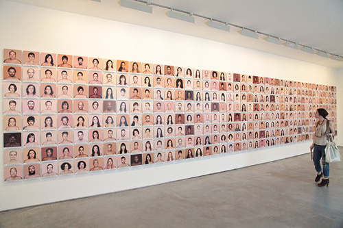
Humanae is “work in progress” project by Brazilian photographer Angelica Dass. The project intends to make an inventory of the spectrum of different human skin color. There is no previous selection of participants or classifications based on race, gender, nationality etc. The participants are volunteers who find out about the project and want to participate. The collection is an ever-growing mosaic, it is an open project with no end date.
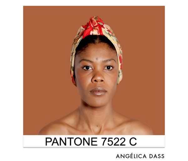
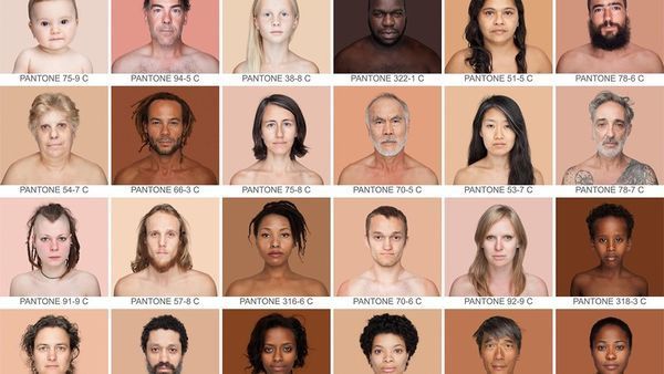
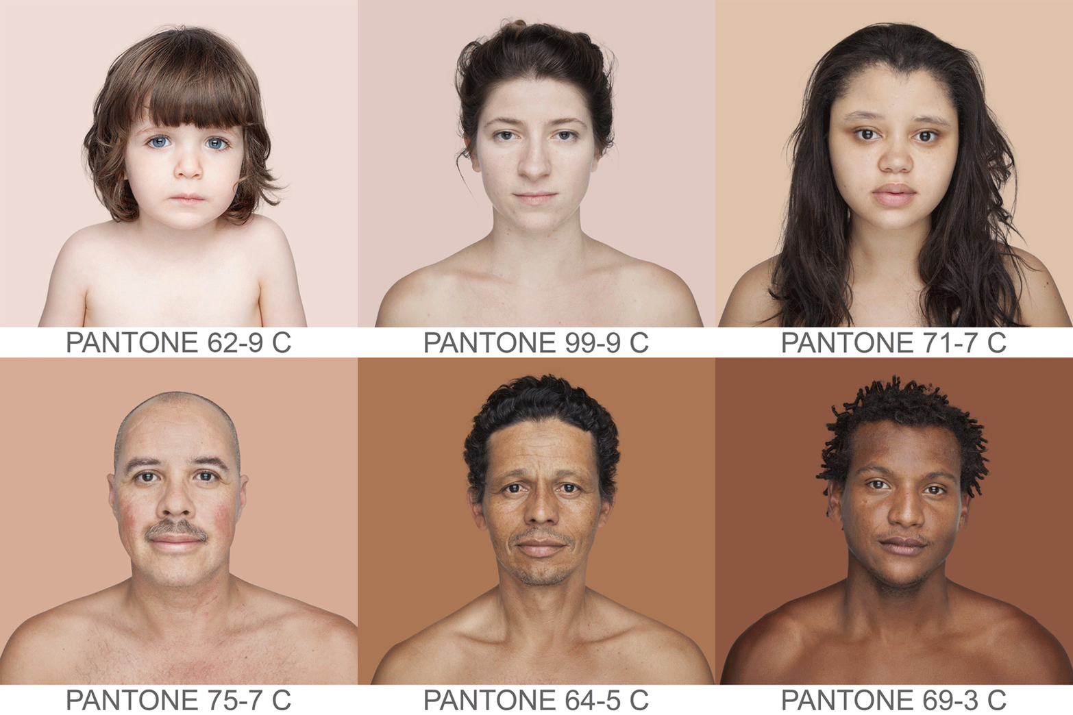
Angelica belongs to a multiracial family, so growing up she was very aware of how others view her, especially because of the color of her skin. This led her to realize how the complexity of skin color is often forgotten by use of labels. This project is her pursuit of representing the true colors of our skin, rather than the untrue white, black, yellow, red or brown, which often try to contain us in boxes; Her aim is to catalog every conceivable skin color on this Earth. Dass uses the different colors of skin to celebrate the wide spectrum of color, and dilute the notion of superiority of a particular skin color. Using Pantone as a reference and placing all the pieces on a horizontal line, she breaks the ideas of the preeminence of some races over the other. The process followed to select the background for each photograph is also very methodical, the background for each portrait is the Pantone color tone identical to a sample of 11X11 pixels taken from the face of the photographed. The alphanumeric codes of Pantone allow the images to be reproduced accurately between various types of media.
In my opinion, the idea of Pantone colors itself has premises of equality, as all colors have equal importance on the Pantone Scale. This creates a safe space for the project and enables one to see the beauty of all skin colors regardless of race and other social conditions. The absence of accessories in the photographs is another way of implying equality; by withholding any information about the subject apart from what is visible in the frame the photographer is inhibiting the viewer from making any judgments about the people photographed, thus project is challenging our ideas of color, nationality, races and other social boundaries. I feel this project is a great way of conveying ideas of equality, it empowers the people who are photographed as much as the people who are viewing it. It can be reproduced on various mediums accurately, and moreover, it is a great conversation starter when it comes to the topic of race and color.
It has now become a collection that is being used as a tool by various professionals like teachers, scientist and researchers in the fields of education, human ethnicity, pathophysiology, face recognition, Alzheimer's etc.; this is the aspect of this project that interests me the most. Humanae being used by such variety of professionals is a great example of how an arts and design social project can be applied in other fields.
Humanae seems to fall more in the domain of an artistic and participatory project. it is artistic because it is highly driven by the ideas of the designer and makes use of a strong narrative which is her personal view, but at the same time it is participatory as it empowers the participants in many ways, it is trying to break the stigma related to skin color by inclusion. Humanae addresses an issue which is very prevalent in the world right now and is against the ideas and preconceived notions of our society today. It thus also to some level qualify as a contextual and transformative piece of work; by using shared authorship and promoting local proposals that operate globally, it is creating awareness without political ideology.
Even though the project has been very successful, one issue that I think could be addressed better is that of communication. The project seems to be very famous and known amongst the people that are aware of developments in the design world, but the issues and stigma related to skin color also exist in people that have more or less no access to this project. In many countries, the racial divide amongst people due is very ingrained in the local culture, it is very hard to change the ideas of people with such strong beliefs using such a passive stance about a sensitive issue. Maybe in this regard, I see an opportunity to educate and spread the word better. This is possible through a more immersive platform than just the internet, to make the project more inclusive.
Another aspect of this project that I personally would like to change is the fact that is relying on a scale i.e. Pantone, which is not very universally understood. Not everybody is aware of what Pantone stands for. I agree that the use of Pantone colors is adding a lot more dimension to the project, but using the trademark of Pantone also makes it seem a little commercial; almost like an advertisement for Pantone.
My study of this project led me to classify it as slightly digestive and fairly alto-relational project. It is digestive because it does not shock the viewer, mostly overwhelms them to inspire change. This project is leaning towards alto-relational, it is driven by the vision of the designer more than it is by the people. It does rely on the people for participation, but the idea behind the project belongs to the designer. Though I do agree that without the support from participants the project would not have succeeded, thus placing it somewhere in the center of the spectrum between allo-relational and alto relational. In conclusion, I think as a project Humanae is very strong and has a lot of potential to make people think about their perception of skin color and ethnicity. Though it has its weak points, the project still embodies many of the ideas that define the spirit of our times and challenges a lot of widespread orthodox ideas about ethnicity, race and skin color. Overall the project only needs minor intervention for improving the reach. The charm of human lies in its inclusive nature, it is effortlessly making a safe space for the whole of our species, making humanae a unique and effective project.


