Difference between revisions of "Retour Afzender"
(removed spaces from fig catpions) |
(remove Category:Issue_2 - as test) |
||
| Line 32: | Line 32: | ||
[[File:BBB.png|Exhausted of all legal procedures]] | [[File:BBB.png|Exhausted of all legal procedures]] | ||
| − | + | ||
[[Category:Projects]] | [[Category:Projects]] | ||
[[Category:03_Proof_Me]] | [[Category:03_Proof_Me]] | ||
[[Category:Politics]] | [[Category:Politics]] | ||
Revision as of 13:45, 21 June 2016
Author: Lou Muuse
Photography
www.retourafzender.eu
Storytelling
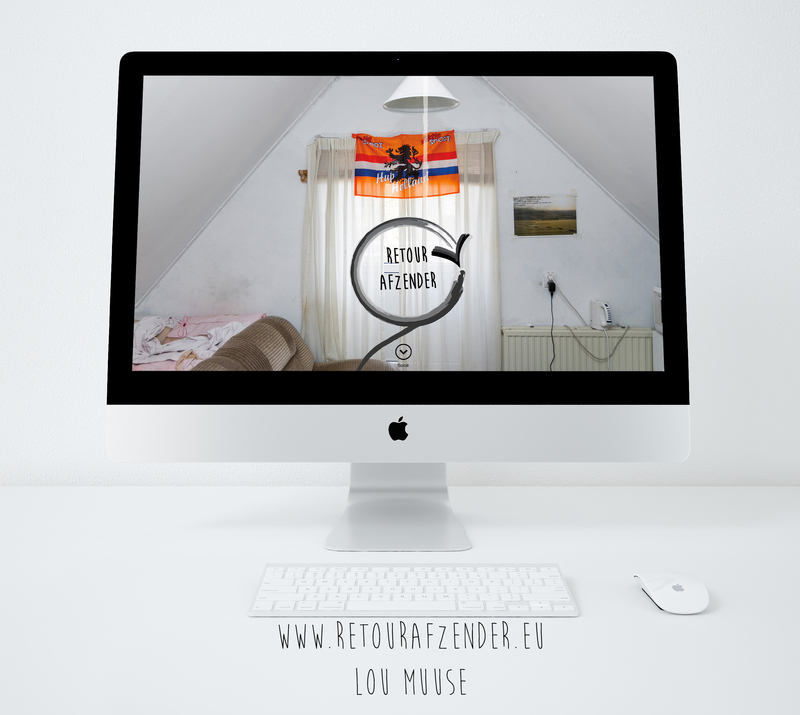
Asylum Seekers, we know they stay here. But were do they stay? For my project Retour Afzender I went looking for these places and visualized this into a multimedia project.
The most important goal in this project was to combine all the different information into a clear overview of the Dutch asylum system. At the beginning I already knew I didn’t want to make just a book. A book can have a closed character and I wanted to spread the word with my project. Therefore I decided I had to make a website where all the elements of storytelling will come together. It isn’t enough to view a photo on the web. For me the idea of a website immediately felt right. I found a new way to tell the asylum story.
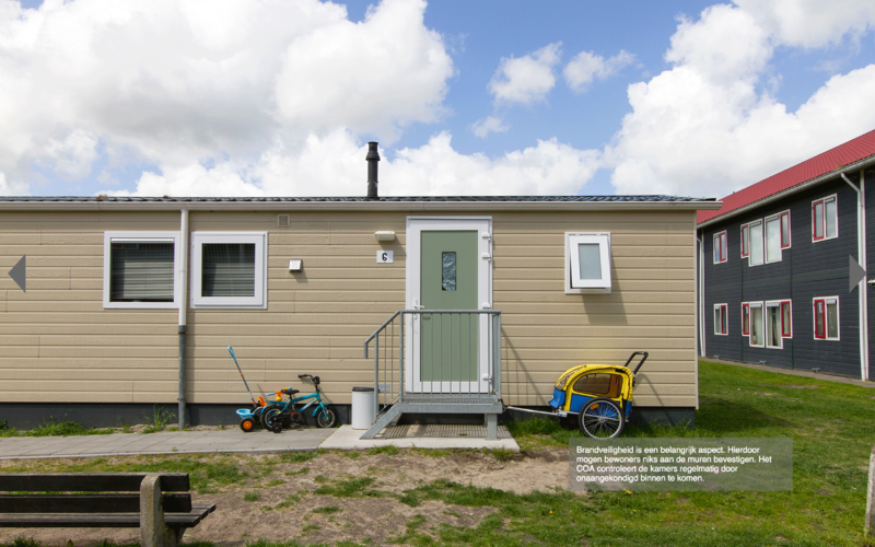
In my project, photography is the base. I photograph the locations were the asylum seekers stay during the process. With the photos that I take I want to show an open-minded view of the locations were the refugees stay during their process. I did this by shooting the interior of the provisional locations where the asylum seekers stay. I tried to not show people in the pictures of the interior. I did this primarily so that people can easily identify themselves with the places, when there are no people in the picture. Secondly, there are a lot of photography projects about refugees with the people as subject.
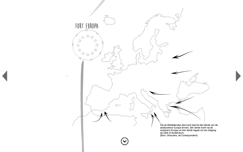
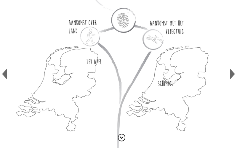
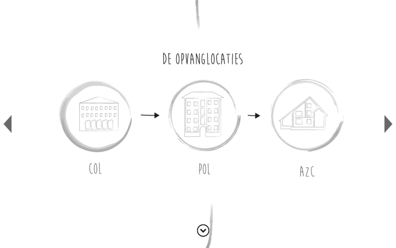
For the storytelling of the system, I needed more than photography. I also used illustrations, maps, text and infographics. With the illustrations I visualized the steps in the system procedure. On my website, each stop is a different location in the system. All the stops are a category. Here it was essential to work with icons to make it visual. Every asylum seeker centre works with icons to make it visual for the asylum seekers. Most of asylum seekers can't speak Dutch when they come here, so they use symbols for the communication.
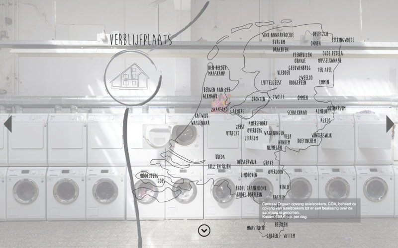
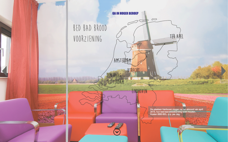
It was important to show where the asylum seekers were in the country. I used maps to locate them. They experience the Netherlands completely different. They see a lot of very weird place names which the most of the Dutch themselves have never heard of. The asylum seekers centre are far away from the bigger cities. The majority of the centers are in the east of Holland. Sometimes there is no public transport, isolating the asylum seekers from Dutch society.
For this project I used many different elements to make an understanding view of the asylum seekers system and the provisional locations. Take a look at the website www.retourafzender.eu. Unfortunately all the text on the website is Dutch. The Dutch government happens to communicate in the Dutch language with the asylum seekers and refugees, though most of the asylum seekers can’t speak Dutch.
