Retour Afzender
Author: Lou Muuse
We all know there are asylum seekers living in our country. But where exactly do they live? For my project Retour Afzender I went looking for these places and visualised this research in a multimedia project. I began Retour Afzender as a photojournalist project. Registering as a volunteer worker for Dutch asylum centres, I was able to enter a parallel universe that is normally hidden to the public, even to news media. I ended up not simply taking pictures, but also researching the system of Dutch asylum procedures, and documenting the many steps of this system through images and text on a website. The conclusion of my research was simple: that the purpose of these procedures is to get the refugees out of the country again.
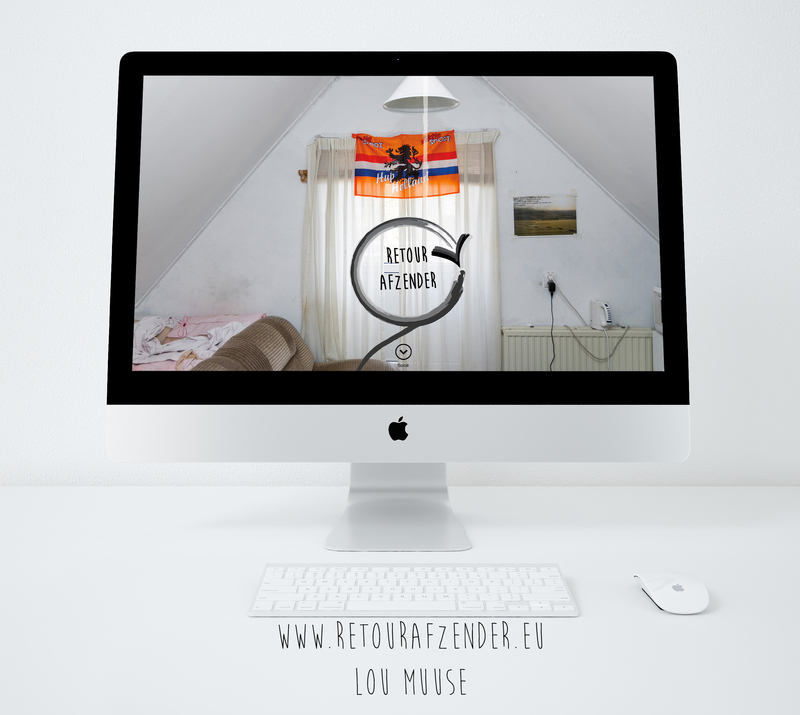
Website: www.retourafzender.eu
Contents
Storytelling
The most important goal for this project was to combine all the different information into a clear overview of the Dutch asylum system. At the beginning I already knew I didn’t want to make just a book. A book can have a ‘closed’ character and I wanted to use my project to ‘spread the word’. Therefore I decided I had to make a website where all the elements of the storytelling would come together. It isn’t enough to simply view a photo on the web. For me the idea of an interactive website immediately felt right. I had found a new way to tell the asylum story.
Photography
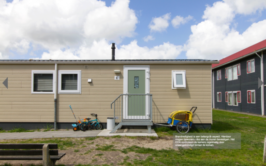
Photography is the foundation of my project. With my photos I want to present an open-minded view of the provisional locations where refugees stay during the asylum process. I did this by shooting the interiors of the locations, and tried not show any people in these pictures. I did this primarily so that people could identify more easily with the locations. Also, there are already many photography projects about refugees focusing on people as the subject.
Icons
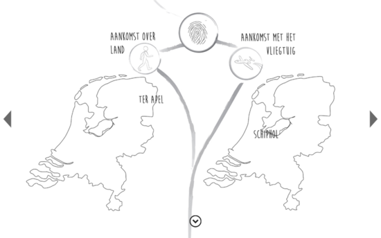
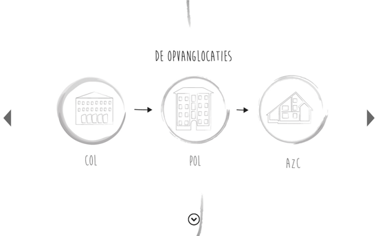
For the storytelling of the asylum system, I needed more than photography; I also used illustrations, maps, text and infographics. With the illustrations I visualised the steps in the asylum procedure. On my website, each step is a different location in the system. Here it was essential to work with icons to present the information visually. All asylum seeker centres use icons to present information visually to the asylum seekers. Most asylum seekers don’t speak Dutch when they arrive here, which is why symbols are used for communication.
Mapping
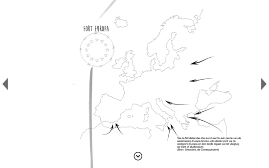
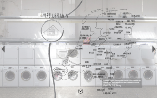
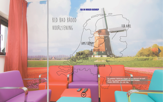
It was important to show where asylum seekers are located in the country. I used maps to do this. Asylum seekers experience the Netherlands in a completely different way as we do. They see a lot of very weird place names, which most Dutch people themselves have never heard of. The asylum seekers centres are far away from the big cities. Most of the centres are in the east of the Netherlands. Sometimes there is no public transportation, isolating the asylum seekers even more from Dutch society.
Language
For this project I used many different elements to present an overview of the asylum system and the provisional locations. You can see the project on the website www.retourafzender.eu. Please note that all the text on the website is in Dutch. Also, keep in mind that the Dutch government communicates in the Dutch language with the asylum seekers and refugees, though most asylum seekers don’t speak Dutch.
Discussion
The editorial board invites readers to reflect and react on the following question: After graduation, the project Retour Afzender was further developed in print in collaboration with the WdKA’s Hybrid Publishing Practices. Researching and experimenting across a broad range of processes native to digital and analog media, Hybrid Publishing Practices fosters novel approaches to design, writing, reading and dissemination, and embraces the pluriformity of publishing made possible through the legacies of Gutenberg’s press to present-day technologies. This resulted in a beautiful publication which will be presented at the Beyond Social event during the final examination event ‘WdKA Finals 2016’. But in what sense is this publication hybrid? What is the ideal hybrid publication, and why? We are looking forward to your contributions.
Photography
www.retourafzender.eu
Storytelling
Asylum Seekers, we know they stay here. But were do they stay? For my project Retour Afzender I went looking for these places and visualized this into a multimedia project.
The most important goal in this project was to combine all the different information into a clear overview of the Dutch asylum system. At the beginning I already knew I didn’t want to make just a book. A book can have a closed character and I wanted to spread the word with my project. Therefore I decided I had to make a website where all the elements of storytelling will come together. It isn’t enough to view a photo on the web. For me the idea of a website immediately felt right. I found a new way to tell the asylum story.
In my project, photography is the base. I photograph the locations were the asylum seekers stay during the process. With the photos that I take I want to show an open-minded view of the locations were the refugees stay during their process. I did this by shooting the interior of the provisional locations where the asylum seekers stay. I tried to not show people in the pictures of the interior. I did this primarily so that people can easily identify themselves with the places, when there are no people in the picture. Secondly, there are a lot of photography projects about refugees with the people as subject.
For the storytelling of the system, I needed more than photography. I also used illustrations, maps, text and infographics. With the illustrations I visualized the steps in the system procedure. On my website, each stop is a different location in the system. All the stops are a category. Here it was essential to work with icons to make it visual. Every asylum seeker centre works with icons to make it visual for the asylum seekers. Most of asylum seekers can't speak Dutch when they come here, so they use symbols for the communication.
It was important to show where the asylum seekers were in the country. I used maps to locate them. They experience the Netherlands completely different. They see a lot of very weird place names which the most of the Dutch themselves have never heard of. The asylum seekers centre are far away from the bigger cities. The majority of the centers are in the east of Holland. Sometimes there is no public transport, isolating the asylum seekers from Dutch society.
For this project I used many different elements to make an understanding view of the asylum seekers system and the provisional locations. Take a look at the website www.retourafzender.eu. Unfortunately all the text on the website is Dutch. The Dutch government happens to communicate in the Dutch language with the asylum seekers and refugees, though most of the asylum seekers can’t speak Dutch.
